Hoosick Falls

Some dear and wonderful friends of ours have a family cabin on a remote lake in upstate New York.  They get to use the cabin for a week or two each Summer (on a rotation with the rest of their family), and for the last few years we have been lucky enough to be invited along.

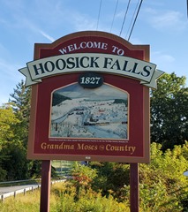
We drive a different route every year, mostly because Vermont and upstate New York are just plain beautiful, and every new route offers us some new adventure.  Last year, we drove through the town of Hoosick Falls, NY.  As we passed the sign (pictured), I stopped the car to take a photo.  When I returned to the car I took a moment to send the photo to Drew, for reasons that will become readily apparent.  As I pulled away from the curb to resume our journey, my son asked what the stop and photo op had been about.  My wife and I exchanged a remarkably communicative glance (as married couples do).  ‘Do you think he’s old enough?’ my half-raised eyebrow asked.  ‘Yeah –what the hell,’ her barely perceptible shrug responded, ‘Go ahead’.

And so, at long last, I told my son the story of the first time I encountered the small, scenic village of Hoosick Falls, New York.


* * *

If I remember correctly, it was some time in the Eighties (I will not bother to narrow it down any further than this.  There really isn’t any reason to).  A couple friends, Kerry and Steve (siblings), were attending Green Mountain College in Poultney, Vermont.  A bunch of us had heard (through Pete, who had attended said college years previously), that Green Mountain College was famous for the epic quality of its Hallowe’en celebrations, so a handful of us (seven, if I remember correctly) piled into David’s 1971 Chevy Impala and set out Northward on route 22 in New York.  As we passed through a series of sleepy New York towns, we discovered that someone amongst our number had some kind of tale to tell about almost every town we passed through – either an accident or an arrest of some kind.

Fair warning from the universe.  Yet we failed to listen.

We found ourselves devoid of music on the trip. I don’t remember if it was due to a broken radio or just that at the time upstate New York was a barren wasteland when it came to radio stations.  Anyway, we amused ourselves by singing (loudly and mostly off key) Maxwell’s Silver Hammer by the Beatles.

Our journey first got interrupted just after we entered into Hoosick Falls.  A passing pickup truck full of Hallowe’en revelers passed by and seized the opportunity to lob a half-dozen or so eggs at our vehicle.  We did not begrudge them this behavior, as we were busy misspending our own youth at the time, but the windows of the car were well covered in egg so we stopped at a supermarket to procure some paper towels to cleanse the car before continuing our journey.

Once we had stopped, one of our number (not mentioning any names, but it was totally Diane) got out of the car and placed a beer on the roof of the vehicle.  This immediately caught the attention of the local constabulary, who approached at speed to introduce themselves.

The parking lot of Price Chopper failed to adequately serve this purpose, so the officers decided to remove the lot of us to the local Police Station.  Or rather they would have had they had such a place to remove us to.  It turned out the Police Station had recently burned down, so instead the policemen took us to a back room at the local Fire Station, which for the interim was serving in place of the Police Station.

The constabulary processed us (as they are wont to do), then took us to the Courthouse (upstairs in the Fire Station – the Courthouse and Police Station had shared a building) to await a judge, who would determine our fate.

Before too long, the Honorable Judge Bob arrived.  We knew this was his name, as he was wearing a (dirty) gas station attendant’s uniform, and above his left breast pocket there was affixed a small, oval patch upon which the word “Bob” was embroidered.

Bob was not pleased.  Lucky for us, it was the local constabulary who drew his ire, as he had been enjoying a quiet beer at a local bar when he received the summons to join us, and he decided it was the police who were ultimately responsible for the half-beer he had felt compelled to leave behind on the bar.  Determined to vex his fellows in the law enforcement community, Bob therefore fined us the smallest amount allowed by law:  $25 each.  Luckily, one of our number had brought along some cash (pretty sure it was David), so by emptying all our pockets we were able to pay our fines and sidle out the door.

Which was when it happened.  On our way out of the building, we passed a line of lockers the police officers used to transform themselves into civilians and vice versa.  Atop the lockers sat a lone policeman’s hat – practically the Holy Grail for a bunch of wannabe hoodlums like ourselves.  At least four of our number reached for the hat as we passed by.  It was Drew who came away with it.

And so our journey continued.  We got ten or so miles down the road, and one of our number wondered aloud where we had left off singing Maxwell’s Silver Hammer.  Nobody could remember, so we started from the beginning.  Shortly thereafter, some representatives of the law enforcement community decided they had not gotten enough of our company.

This time there were four police cars.  Two state police cars, two from Hoosick Falls, one of which disgorged an irate officer with a totally unadorned scalp.

Give me back my fuckin’ hat!” he sputtered.

It did not take long for Drew to realize the jig was up.  He surrendered the hat, as well as himself, and we followed the police back to Hoosick Falls to see what we could do (if anything).  Back at the Police Station/Courthouse/Fire Station, only one of our number was allowed in (I think it was Jason), who was told that Drew was going to be held on the maximum allowable bail: $1,000.

Needless to say, we were several decimal points away from this figure (in the wrong direction), so Drew admonished us to resume our journey without him.  We eventually agreed to do so.

And so our intrepid heroes resumed their ill-fated journey.  This time we got about 15-20 miles down the road before someone idiotically brought up Maxwell’s Silver Hammer again.  Throwing caution to the wind, we once again lifted our voices in song.

And once again, we failed to make it to the end of the song.  This time, the driver’s side front wheel blew off the car, shot across the road and was lost forever in the pasture on the far side.  Jason was driving (we were probably doing around 60 or so), but he thought fast and reacted faster and the car ground to a halt safely on the side of the road amidst a shower of sparks and the screams of protesting metal.

We dispatched Tommy and Jason to the next town to call Kerry and Steve for help while the rest of us waited with the car.  It took a little longer than we expected because the phone they located was in a bar and – well – you know.  Eventually Steve came to rescue us and even more eventually we made it to Green Mountain College.

It turned out that somewhere in the midst of all this Drew had tried to call the college looking for us.  Judge Bob had been dragged out of the bar again, and this time he was pissed.  To show his displeasure, he again assessed the smallest possible fine under the law.  This time it was $75.  Which we could have managed if we hadn’t been twiddling our thumbs on the side of the road while Tommy and Jason swapped stories with locals in a roadside bar.  So Drew ended up having to call his parents.  His father was not pleased.


* * *


By the time I finished relating this story, we were well away from Hoosick Falls.  My son didn’t say anything at first, and I was just beginning to get concerned when he finally spoke up.

“Wow, Dad,” he said, something in his voice I couldn’t quite identify.  “When did you get so boring?”


signature_thumb.gif

twitter-naziA short time ago, A friend sent a message to me asking for some assistance.  Her teenage daughter was spending more time online than was desirable, and my friend asked if I knew of an app or router setting that could limit her daughter’s usage.  I told my friend I assumed such things existed and that I would do a little research and get back to her.

Turns out I was lying.  I didn’t do any research at all.  Instead I just thought about it for a day, then got back to my friend and said “I think you’re looking for a technological solution to a behavioral problem.  This is a mistake.”

Luckily, my friend had already realized this and had taken appropriate steps.

I see a similar problem all over the Internet.  Specifically in social media.  In a nutshell, social media seems to be heavy on the ‘media’ and light on the ‘social’.

By nature, most humans are not inherently nice.  This is a by-product of being a species that clawed its way to the top of the food chain.  However, we are also very social creatures, so we have had to develop a toolkit we can use so that we can occupy the same spaces without resorting to violence.  And we have done so, in a variety of ways (which I will hereafter refer to collectively as ‘the social contract’).  Unfortunately, this has led the social web to the erroneous conclusion that the social contract springs into existence spontaneously and organically.  It doesn’t.  Rather, the social contract is painstakingly constructed and is constantly renegotiated.  What makes this process possible is the fact that all participants are effectively empowered to enforce the social contract.  The reason people don’t walk into bars and scream obscenities at strangers is that doing so results in paying a real, usually immediate social price.

It is this characteristic that social media glaringly lacks.  In many ways, it actually provides an opposite situation.  In the real world, if a person enters into an ongoing social situation and begins to act belligerently toward the participants, the social group itself will deal with the intruder.  This most often simply manifests itself in the removal of the newcomer.  Sometimes this is managed by someone in authority (the owner of an establishment, or some form of security personnel, for example).  Other times it is handled by the social group themselves (in my experience it almost never necessitates any kind of physical intervention).  Regardless of the particulars, though, it is not the social group that pays the price for the intrusion but rather the intruders themselves.

Not so in social media.  In this case, if an existing social group (say a Twitter discussion thread) is joined by someone inclined to act belligerently, the group has no power to address the situation.  The few tools they are given to use in these situations are woefully insufficient.  Usually they amount to nothing more than some kind of block/mute/ignore function.  Because of this, in social media it is the group that pays the price for an individual’s antisocial behavior, rather the individual causing the problem.

The real-world equivalent would be someone walking into a bar and shouting obscenities, in response to which everyone in the bar simply puts their fingers in their ears and chants “I’m not listening.  I’m not listening.”

Foolishness.  Utter foolishness.  Not least because it would never – ever – work.  There is nothing about this kind of group behavior that in any realistic way would discourage said antisocial behavior.  Quite the opposite, actually.

This is why social media is inherently broken.  And it appears that it’s going to stay broken, because the people who are in a position to fix it show little desire to do so (for various reasons, most of which are money).

Which is why, I’m sorry to say, I have decided to pretty much cease my personal participation in social media.  Not completely – just mostly.  I just don’t find much fun in playing with broken toys.  I’m not deleting any accounts just yet, though, mainly because I have hope that in the future at least some areas of social media will figure this crap out and give the people the tools necessary to enforce the social contract.

This hope is not completely unfounded.  There are some areas of the Internet that have large social components and still manage to have a functioning social contract.  Most notable among these are video games (not all of them, unfortunately).  This typically manifests in the form of some kind of guild/clan system, where the players themselves are given the ability to administer the social contract.  These kind of systems allow for like-minded people to form their own social groups that are subject to a group-determined code of conduct that is enforced by the group.  Just like in the real world.

I’m not suggesting that Facebook or Twitter start using a guild system.  What I’m saying is that those systems prove that social spaces on the Internet can function properly.  All it takes is an awareness of where the actual power in the social contract resides.

So I’ll keep checking in from time to time.

signature_thumb.gif

I’ve been using Twitter since late 2008. At first I didn’t think much of it, viewing it (as many people do) as a vehicle through which people share the insipid minutiae of their lives.  But I had enough of a general interest in social media to check it out, so I took it for a spin to see if I liked it.  At first I had trouble “getting” it, and it was very difficult for me to get used to the character limit.  I decided to take this as a challenge and as an opportunity to develop some skills I obviously needed.  Once I got somewhat used to the platform and began to look around, I quickly became enamored.

This is because it wasn’t long before I discovered some of my fellow Map Dorks.  Having easy access to a group of people who shared my love of maps, software and data was a totally new experience for me.  And it was rather thrilling.  The number of Map Dorks I followed grew quickly, and it wasn’t long before I realized that the mapping community was using Twitter as a tool rather than a platform.  It seemed less like being hit by a firehose of the universe’s random verbiage and more like sitting around in a bar at a conference.

I was completely sold the night I tried to follow a tutorial to set up a personal GeoServer map server in my home office.  I couldn’t get it to work, and after trying for a while I got frustrated and gave up.  I tossed a mention of my frustration into the void of my Twitter stream, and before long a guy named Steve sent me a Tweet to see if he could help.  Turned out Steve was the guy who wrote the tutorial, and his initial Tweet turned into a lengthy real-time support session (I don’t think we ever got it running.  The problem was that I thought I was good enough to get it up and running on an early beta version of Windows 7.  I wasn’t).

It was like answering a knock at the door to find a Jedi Knight saying “I felt a disturbance in the Force”.

I was floored by the experience, for a couple of reasons.  First was the sheer power of leveraging Twitter in such a fashion.  I still don’t understand why businesses don’t use Twitter in this manner to provide needed but not necessarily asked for customer support.  Seems to me like it would be a gold mine.

Second was that Steve was a nice enough guy to spend a bunch of his time helping somebody on the Internet that he had never met.  And as I looked back in time (and as I paid attention going forward), I found that Steve wasn’t the only Map Dork out there who behaved this way.  In fact, being open, accessible, helpful and informative turns out to be the norm for Map Dorks.  The reason my experiences with Twitter turned out so differently than other people I knew – the reason my experiences were so overwhelmingly positive – was simply because I had fallen in with good companions.  Because through Twitter I had met a group of people who were using Twitter as a tool to communicate, support, help, share and learn from each other.  In short, we were leveraging Twitter as a vehicle through which we could build a community.

And this process has proven to be ongoing and shows no signs of slowing.  Emily noticed the nature of this community when she started GISTribe.  At least, I assume she did since she chose the word ‘tribe’ rather than ‘committee’ or ‘twitter group’ or some similar nonsense.  GISTribe has done a great deal toward maintaining and growing our online community, as have a slew of channels on Slack.  People too numerous to mention have dedicated and continue to dedicate enormous amounts of their time and energy to the community, and because of it the network keeps growing and the support structure keeps getting stronger.

Like every community, ours sometimes encounters problems.  An incident occurred last week, the details of which I know little about.  I do know there was some teasing (I even participated a bit) and there were some hurt feelings.  While I don’t know the details (as I said), it appears that the entire thing started as a misunderstanding about the nature of this community.  That it is a community of peers (but not the kind that sit in Parliament).

An important, fundamental part of our community is our lack of hierarchy.  As people we are individualists, as professionals we are dedicated to the discipline, and as a group we are egalitarian as fuck.

And we all contribute to the community, as far as we are willing and able.  There are some who contribute more to the community and/or profession than others (some significantly so), and for this the community happily responds with gratitude and respect.  But not by bestowing celebrity.  In an egalitarian community, distinction is applied with an even hand.

As a community, it falls to all of us to maintain the social contract.  To see to it that our discussions are exchanges of ideas rather than hyperbolic assaults.  That our disagreements (even arguments) are differences of opinion rather than contests of will.

Sometimes this isn’t so easy and we screw things up.  But we’re human and we make mistakes so that’s okay.  And sometimes we just can’t make things work.  You may find yourself unable to reconcile your differences with another community member.  This also is okay.  It can and does happen to anyone (it has happened to me more than once).  Sometimes it’s best for the community if some of its members simply avoid contact with one another.  Twitter provides a variety of tools for use in such situations.  Use them, if need be.  The community will benefit.

Lastly, as an egalitarian community the only assigned tasks any of us have are the ones we assign to ourselves.  All other tasks become the responsibility of the group as a whole, and it falls upon all of us to see that they get done.

So what do you say we all grab a broom and clean up this mess so we can move forward?

signature_thumb.gif

Framers

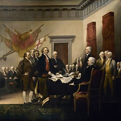
The current background music in our house is the soundtrack to Hamilton: An American Musical.  This is a good thing, as my wife adores it, I like it more every day, and my son’s understanding of US history is positively impacted.  As a parent, as an American and as a thinking person, I want my son to know what the Founding Drunkards were really like.  I don’t want him to grow up believing the same lies I was taught when I was his age.  For good reason.

Here’s the deal – the Founding Drunkards were human.  Flawed, annoying, ridiculous humans.  Just like the rest of us.  Most everyone who has a knowledge of US history beyond the grade school level is aware of this.

When we are young and our society thinks our young minds need to be instilled with a certain amount of patriotism (often confused with nationalism), we are taught that the Founders are larger-than-life figures, noble in purpose and pure of heart.  The idea is to get us to love our country and the Founders are presented as the personification(s) of everything that is good and beautiful and decent about the United States of America.

As we get older, most of us (especially the historians among us) get a fuller, more accurate picture of the Drunkards.  We learn a thing or two about their flaws.  We discover – despite ourselves – that they were human, and therefore necessarily flawed.  And if we really pay attention, we notice that most of them were deeply flawed.

Case in point:  slavery.  I’m sure most of you know that many of the Founding Drunkards were slave owners (with notable exceptions – Hamilton, for instance, was a dedicated abolitionist).  I’m sure you’re also aware of the usual narratives offered to explain why it’s somehow magically okay that they were slave owners.  We are told, for instance, that Washington inherited slaves (as though this made it acceptable).  And this is partially true.  When he was eleven years old, Washington inherited ten slaves.  At the time of his death, however, there were a total of 318 slaves residing at Mount Vernon.

Washington was by no means unique in this.  Jefferson’s relations with his slaves are well known.  The point is that the bulk of them weren’t exactly against slavery.

I am not judging these men here.  I am merely trying to underscore a point.  You see, all of the Founding Drunkards knew – they knew – that slavery was morally wrong.  Yet for many of them their economic standing depended upon slavery.  They were rich and powerful men and their wealth and their power depended upon slavery.  Which leads to my point, which is important enough to merit large boldface letters:

When faced with a choice between their morals or their wealth and power, they did NOT choose their morals.

Does this make them bad people?  Maybe.  I don’t know, and that’s not what I’m talking about here.

What I’m talking about is the basic design spec of the United States of America.  This country was designed by a bunch of guys who cared more about their own wealth and power than about other people’s basic human rights.  Hell – they ranked their own wealth and power above their own morals.  Their priorities and motives are evident.

And these are the guys who designed our government and our political system.

Think about that for a minute.

From the outset, the United States of America was designed by a bunch of rich white guys for the express purpose of preserving and advancing their own personal wealth and power.  For this reason, they specifically designed it to be an amoral system.  And this turned out to be both a bug and a feature.

It’s a feature because it made for the separation of church and state, an idea that worked pretty well until the 1950s when American politicians started trying to inject their own personal God into our lives.  We’ve been striving against this ever since – and have been largely successful – but the struggle continues.  As you probably already know.

The amoral nature of our system is a bug in that there is absolutely no common decency built into it whatsoever.  But it’s an easy bug to forgive because there’s no reasonable way to achieve the feature without also accepting the bug.

The problem with all of this is that most of us – deep down – don’t really understand it.  We may know the details on an intellectual level, but underneath it all we really believe it’s something different.  When we are children and are taught about the Founders as great and noble and admirable, we are instilled with an unreasonable – and unreasoning – faith in our political system.

And this gives us funny ideas about politics.  We find ourselves believing in things rather than thinking about them.  We forget that politics attracts wealthy, powerful, ambitious people.  We believe that there really can be larger than life figures who – superhero-like – will arrive on the political scene and save us all.

I’m sorry to inform you that this just isn’t the case.  It never has been, nor will it ever be.  It just simply is not in the job spec.  In fact, the nature of American politics actively repulses people who do not place their own ambition above morals and ethics.

This is not a problem if we simply look at the situation clearly.  What we have right now in the United States of America is a job opening.  Just that.  I’m not drawing an analogy here – we really do have a job opening and it’s up to We The People to fill it.  And if you’ve been part of the hiring process before you know that it’s always a bad idea to fill a job vacancy based only on how much you like a particular candidate.

I’m not telling you who to vote for.  I assume that if you’ve read this far you probably have enough interest in the process to already be leaning toward a specific candidate.  Chances are there’s somebody running whose message resonates with you and who is saying the kind of things you want to hear.

Which means they wrote a good cover letter.  They figured out which things you – a prospective employer – want to hear, and they smartly said those things.  This is an important part of the hiring process, but it’s just the beginning.  Now it’s time to read the résumé.

Seriously.  You wouldn’t hire someone based on their cover letter without also reading their résumé.  So why would you elect someone based solely on their speeches without also considering their qualifications?

This should not be an emotional process, America, but a rational one.

signature

Greenfield 2In our last outing we put together a simple map.  Having reached this point, the wise cartographer asks itself (when discussing cartographers I default to non-specific, non-human pronouns):  “Am I done?  Does this map suffice?”

Actually, the answer to this question should have been determined before we even started.  One of my favorite professors used to say “Begin every project with a proposal.  It’s the easiest and best way to know when you’re done.”

Anyway, if the map you’ve already made suits your purposes, congratulations.  There is no reason for you to continue reading this, so by all means go back to whatever your favorite activity happens to be.  I promise I won’t take it personally.  If, however, you need a less simple map – or if you’re just like me (any map worth making is worth making pretty) – then please read on.

The plan here is to avail ourselves of some of QGIS’s advanced stylizing techniques to apply a variety of better looking symbology to the map.  We will work in an order the reverse of that which we used last time (top down as opposed to bottom up) because this neatly follows a least-to-most complicated trajectory (with one exception).

Structures

Our general goal here is to construct a believable illusion of three dimensions.  We aren’t going to try to achieve true 3D (or – more accurately – 2.5D), instead we’ll just use a few tricks to fool the eye.  In the case of the structures layer we’ll just apply a simple drop shadow.  Double-click on the ‘Structures’ layer to open the Properties window.  Click on ‘Style’ in the left-hand sidebar if it isn’t highlighted already.  Select a lighter color for the polygons (I used a grey: #707070), then check the ‘Draw effects’ box in the main area of the window.  Click on the small star that resultantly turned yellow to open up the Draw effects window.  Check the ‘Drop Shadow’ box on the left, change the Offset to 4 Map Units, change the Blur Radius to 1, and change the Blend Mode to Normal.  Click ‘Okay’ a couple of times and watch the map redraw itself.


Roads

Roads come in various shapes and sizes.  There are many different attributes of this layer we could use to symbolize our roads, but I think the wisest (read: easiest) way to go is to symbolize them by relative size.  If you right-click on the Title of the ‘Roads’ layer (in the Layers Panel), a menu appears.  Click on ‘Open Attribute’ and a window opens showing you the database that’s attached to the layer (most layers have them).  Feel free to have a look around, and don’t worry if much of it looks like gibberish.  The first column of the attribute table is called ‘Class’ and it is the one we will be using to symbolize the layer.  The road classes are single-digit codes ranging from 1 to 6 (scroll down the MassGIS ‘Roads’ page for an explanation of the classes).  The short explanation is the smaller numbers represent bigger roads and vice versa.  We want to symbolize thicker lines for larger roads, so we’ll just have to tweak it a bit.  Double-click on the ‘Roads’ layer to open the Properties window and change the line style from ‘Single Symbol’ to ‘Graduated’.  Click on the ‘ε’ symbol to the far right of the ‘Column’ selector to open up the Expression Dialog window.  Enter 10-“CLASS” for the expression and click ‘okay’.  Change the Method to ‘Size’ and input a range of 4 to 16.  Bump the Classes up to 6 and change the Mode to ‘Quantile (Equal Count)’.  Click on the word ‘Change’ in the Symbol selector to open up the Symbol Selector window.  Select your line, change the Pen Width to 0.46 Map Units and set the Cap Style to ‘Round’.  Add another line, move it down in the hierarchy, then change its Pen Width to 0.86 Map Units, change its color to grey (#707070) and set its Cap Style to ‘Round’ as well.  Check the Draw Effects box and click on the yellow star.  Select ‘Outer Glow’, change the Spread to 3 Map Units, set the Transparency to 0 and change the color to the same grey as the line itself.  Click ‘okay’ a couple of times and watch the roads redraw themselves.

Almost there.  If you zoom in to get a closer look at the roads you will find that they look funny.  This is because each road is made up of a series of small, straight lines connected together into longer lines that more accurately represent the less-than-straight reality of roads.  Each of these small lines are drawing individually, which makes random grey lines cross over our roads in annoyingly large numbers.  Don’t worry.  We can fix this.

Reopen the Layer Properties window to get back to the layer Styles.  Click on the button labeled ‘Advanced’ and select ‘Symbol Levels’ to open the Symbol Levels dialog.  You will see two columns, Layer 0 and Layer 1.  Everything in the Layer 0 column should say ‘0’ and everything in the Layer 1 column should say ‘1’.  Check the ‘Enable Symbol Levels’ box.  This tells QGIS to draw everything in Column 0 first, then go back and draw everything in Column 1.  Click ‘okay’ twice and watch the roads fix themselves.


Streams

This layer is the exception.  It just needs a little tweaking to make it look differently than lines painted on.  Darken the color a bit (I used #007ac9) and add an Outer Glow:  Spread of 2 Map Units, Blur Radius 3, 50% Transparency, color #46f3f7.


Lakes

When maps are made in 2.5D they are most commonly “lit” from the upper left corner.  I don’t know where this convention came from, but it is so strongly ingrained in us that when maps are “lit” from the bottom they look backwards to us (mountains look like valleys and valleys look like mountains).  Knowing this, we can take advantage of it to make objects on our maps look ‘3D’, either in a positive or negative fashion.  For our bodies of water we’ll go for a negative, making them appear to be cut into the ground surface rather than just sitting upon it.  We do this by applying a highlight to the lower right-hand side and a shadow on the upper left-hand side.

But first we’ll have to specify which polygons we want show and which ones we’d like to hide.  When we look at the MassGIS web page for the dataset we’re using, we see two separate columns in the attribute table that describe the water features.  The first is called WETCODE, and it separates the features into 28 distinct categories.  These categories are also conveniently detailed in another column of the attribute table (IT_VALDESC).  For our purposes, though, this is far more detail than we need.  Instead, we’ll use another, similar column called POLY_CODE, which serves much the same purpose but with only 11 categories.  For our symbology we’ll want to show any features that delineate open water (we’ll include marshland in this group) and hide any other features.  We’ll do this by using Rules Based styling.

Open the layer style and change it from Single Symbol to Rule-based.  Double-click the existing rule (No label) to open the Rule properties dialog.  Click on the Expression button (…) to the right of the ‘Filter’ bar to open the Expression String Builder.  We will want to separate the open water features, which are those with POLY_CODEs of 1,2,6,9 and 10 (for this map we could skip 9 and 10, but we will include them in the name of thoroughness.  Sloppy work is habit forming).  To do this we will build the somewhat awkward expression POLY_CODE=1 OR POLY_CODE=2 OR POLY_CODE=6 OR POLY_CODE=9 OR POLY_CODE=10.  Then we add two additional Simple Fill layers to our symbol, which we will style in order from the top down.  The first we color with the same color we used for Streams (#007ac9), turn off the outline and add an Inner Glow:  20 Map Unit Spread and a darker color (#005b93).  The next is the shadow layer, which we color with a darker shade (#005488), turn off the outline and offset negative 8 X and 8 Y Map Units.  Finally we do the highlight layer, which we color lightly (#70b5d7) and offset positive 8 X and 8 Y Map Units.  Finally, we make the entire layer semi-transparent (a setting of 25 works well).


Contours

For our contours we’re going to want two discrete thicknesses (or ‘weights’) of lines.  A heavier line (called an Index) occurring periodically and a lighter line (called an Interval) occurring everywhere in between.  Because our data will make it easy to do so, our Index lines will occur every 30 meters (if you look at the attribute table you will see a column called ELEV_M.  This is the elevation of each line in meters, and the interval of the lines is 3 meters.  So every 30 meters we get a line that’s a nice round figure – 60, 90, 120, etc).  Since we have hills instead of mountains here in New England, 30 meter Indices are workable without being too crowded.

Before we start, though, we should make our lives easier by combining the two contour layers we’ve been using.  Because we opened zipped files, we cannot edit either of the layers as they are, so we first must convert one of them to a shapefile (a format that has more than its share of issues.  But it works so we’ll just run with it).  Right-click on the Greenfield Contours file and select ‘Save As’.  Choose the appropriate co-ordinate system, browse to the folder you want to save it in (creating said folder if necessary.  I used Maps→Data→Greenfield→Vector→Contours and called the file Greater Greenfield Contours).  Then zoom to the extent of the Montague Contours layer (by right-clicking on it) and select the entirety of it with the Select Features tool.  Copy the features to the clipboard and return to the previous zoom using the Zoom Last button.  Select the Greater Greenfield Contours layer, toggle editing on, paste the features onto it, then save the changes and toggle editing off.  Then clean up by deselecting all features and removing both the Greenfield Contours and Montague Contours layers (by right-clicking them).

Now open the Layer Properties window for Greater Greenfield Contours.  Change the style from Single Symbol to Rules-based.  Double-click the undefined rule and label it ‘Index’.  Open the Expression String Builder and build the expression: floor( “ELEV_M”/10)=( “ELEV_M”/10).  Change the color of the line to #665640, set the Pen Width to 3 Map Units, then open the Draw Effects dialog.  Give it an Inner Glow (2 Map Unit Spread, 3 Blur Radius, 0% Transparency, color #f8a05c) and an Outer Glow (4 Map Unit Spread, 3 Blur Radius, 0% Transparency, color also #f8a05c).

Add a second rule labeled ‘Interval’.  For this one build the following very similar but significantly different expression:  floor( “ELEV_M”/10)<>( “ELEV_M”/10).  Change the color to #665640 and set the Pen Width to 1.25 Map Units.  Give the line an Inner Glow (0.75 Map Unit Spread, 3 Blur Radius, 50% Transparency, color#f8a05c) and an Outer Glow (4 Map Unit Spread, 3 Blur Radius, 50% Transparency, color #f8a50c).  “Okay” your way out of all the dialogs and watch the map redraw itself.


And there we are.  We took our basic map and made it pretty.  Nice work.  It should be noted that not all of this symbology works well at all zoom levels.  If you zoom into and out of various areas of the map you will see what I’m referring to.  Creating symbology that works well for various zoom levels is its own art form and is beyond the scope of this post.  My intent here is only to introduce you to a small sample of the vast styling power of QGIS.  Please continue to explore further on your own.  You won’t regret it.

signature.gif

GreenfieldSo you heard about this GIS thing and you thought to yourself that it might be kind of cool to be able to make your own maps.  But then you looked at the software and decided that it’s rather more dense and complicated and esoteric than you’d like, so you decided that maybe you’d pass on making your own maps and instead just use whatever you could find on the Internet.

Fair enough, but the truth is that making your own maps really isn’t very hard.  Sure, the software may be a little dense and complicated and esoteric, but so is most every word processor on the market.  But this doesn’t stop any of us from firing up Word and using it to write a letter.  The same goes for email.  How many of you can claim to know more than 2% of the full capabilities of Gmail?  I know I can’t.

GIS software can indeed perform a great many complex and wondrous scientific operations, but a working knowledge of them is not a prerequisite for using the software.  With a little bit of knowledge and the right data, pretty much anyone can make a respectable map.

Which is what we’re going to do.  Relax – I’ll walk you through the process.  It probably won’t hurt at all.

The first order of business is to secure the software we’ll be using.  There are a bunch of good options out there, but for today’s exercise we’ll be using QGIS, because it’s solid and dependable, but also because it’s my personal favorite.  Head on over to their download page and download and install whatever version of the latest release is appropriate for your system (I’ll be using 2.12.3 throughout).  I have chosen the latest release over the LTS (long term support) version because it includes a variety of new features that are well worth having.  Besides – if you decide to stick with this GIS thing you’ll be updating your software on a regular basis.

Once you have installed QGIS, fire it up.  Right off the bat there are a couple things we’ll want to do.  The first is to simply rearrange the UI to suit our purposes.  The UI is completely customizable (and easily so – just click on things and move them around), so it’s a simple matter to arrange things to better suit our own habits.  In time you’ll determine the setup that best suits you – in the meantime I’ll show you the setup that suits me (out of the box, at least).  The next thing we want to do is change the CRS of our project.  When we first fire up QGIS it defaults to EPSG 4326 (also known as WGS 84).  Maps are projected, necessarily so because when mapping we are representing a three-dimensional object (Earth) two-dimensionally.  Therefore we must project a map in order to draw it.  Projecting is inescapably imperfect, therefore every map distorts something in some way.  We use a CRS (co-ordinate reference system) to project a map.  WGS 84 is intended for maps of a global scale, but our map will be on a local scale (in Massachusetts).  Therefore we’ll change the CRS  to a projection that distorts less on our more focused scale.  For this map we’ll use EPSG 26986, NAD 83/Massachusetts Mainland (Meters).  If you want to know more about projections and co-ordinate systems, a great resource can be found here.


Now we need data.  For this map our task will be easy (but don’t get used to it.  Finding appropriate data is usually the hardest part of GIS), as Massachusetts has a wonderful State GIS agency called (you guessed it) MassGIS.  We’re only going to use six datasets for our map, which really isn’t much as these projects go.  It’s still data, though, and it needs to be managed, so let’s talk about that for a minute.

GIS is driven by data.  As such, practitioners tend to amass enormous amounts of data.  Data that must be organized.  Maps are made out of data, and a failure to properly wrangle said data can be crippling.  Where did I put that data from 6 months ago?  Which one of the 14 folders called “Project X” did I put it into?  Or is it somewhere else?  It’s a road dataset, so did I put it in the huge folder called “Roads”?

I didn’t just make these questions up.  They are questions I have actually had to ask myself at earlier, less organized points in my career.  Trust me.  Properly managing data is the single most important part of modern GIS.  As an added bonus, well organized data is easier to back up.  The value of this cannot be overstated.

This is how I do it.  I start with one master folder called simply “Maps” (in Windows you can make this folder a distinct Library.  I strongly advise doing so).  This folder is where I keep everything – data, projects – everything.  The advantage of this is that I simply have to back up my “Maps” folder and I can sleep soundly at night.  The disadvantage is that my “Maps” folder can get pretty damn large (and I don’t even work with Big Data.  If I did I think I would have to store it elsewhere).  Inside my “Maps” folder are two other folders:  “Data” and “Projects”.  My “Projects” folder contains a myriad of folders (usually one per project), as well as a separate folder called “Saves”.  This is where I keep all the ‘Saves’ of projects, whichever software I happen to be using.  This way all my software defaults to the correct location whenever I ask it to open a project.

The “Data” folder gets considerably more complicated.  And personal.  Its contents are more individualized and dependent upon the work most often performed and the types of data needed to do so.  In my case, I work most often (almost exclusively) in Massachusetts.  Because of this, MassGIS is my go-to source for data.  So it just makes sense for me to organize my data in a manner similar to the method MassGIS uses to organize their data.  Much of their data is organized by town, and I follow suit.  My “Data” folder slowly fills with folders named for towns in Massachusetts.  Inside each town’s folder I further separate the data into folders for vector data (points, lines, polygons) and raster data (images, digital elevation models).  MassGIS organizes some of its data differently, and for this data I include separate folders, appropriately labeled.  For instance, I have a folder called “Statewide” for those datasets that encompass the entirety of Massachusetts.

For this project we will be using two statewide datasets and four town datasets (three from one town, one from another).  Start here to get them.

Again, the choices you make will be your own.  I’m just describing how I do it.

First, I scroll down the MassGIS download page until I reach the section titled ‘Transportation’ under the ‘Infrastructure’ heading in the ‘Vector Data’ section.  There I click on ‘Mass DOT Roads’, then ‘Download these layers’.  I then scroll down to ‘Greenfield’ (in the left-hand column) and click on the filename (eotroads_114.zip) to initiate the download.  I download the file to Maps→Data→Greenfield→Vector→Roads.  I click my way back to the main download page, then in the next section (‘Other Facilities and Structures’) I download ‘Building Structures (2D, from 2011-2014 Ortho Imagery)’  in a similar fashion (structures_poly_114.zip to Maps→Data→Greenfield→Vector→Structures).  Then, under the ‘Physical Resources’ heading, I download ‘Contours (1:5,000)’ from ‘Elevation and Derived Products’ (while I’m there, I also download this file for the next town over: Montague).  Lastly, I move on to ‘Inland Water Features’ and download ‘MassDEP Wetlands (1:12,000)’.  This one is Statewide, and it is divided into two layers, a polygon layer (wetlandsdep_poly.zip) and a line layer (wetlandsdep_arc.zip), both of which I download to Maps→Data→Statewide→Vector→Hydro.

Now that we have our data we can start building a map.  Our first order of business will be to navigate to our ‘Maps’ folder in QGIS’s Browser panel and then add it to our favorites (right-click on it).  This will greatly facilitate our future mapping endeavors.  Then lets add in our two contour datasets (all you have to do is double-click on them in the Browser Panel – QGIS can read a zip file) and symbolize them (by double-clicking on their names in the Layers panel).


Maps are built in layers, and the order of our layers should roughly mimic the world we are attempting to depict.  So our next order of business should be to add and symbolize our two hydro (water) layers.  For some reason, they come from MassGIS double-zipped, but all that costs us is an extra mouse click.


Next, lets zoom into a more focused area of interest, then add our road and structures layers, symbolizing them as we go.


Lastly, lets rename our layers in the table of contents as something more human-readable (just right-click on them individually) and then save our project.


So now we’ve made a map.  What do you say we put it onto a piece of paper so it can actually be a useful thing?

Click on File→New Print Composer.  Once open, I first change the paper size to the one my printer spits out (ANSI A: Letter).  Then I use the ‘Add New Map’ button to add a map to the composition by clicking and dragging corner to corner.  Then I click on the ‘Item Properties’ tab and change the scale of the map to 1:24,000.  This is because we here in Massachusetts still backwardly use feet and inches, so if I make the scale 1:24,000 on my printed map one inch will equal 2,000 feet.  This makes my paper map a useful and easy-to-use tool in the real world.  Those of you fortunate enough to live in the modern world can do the same thing with the metric system, just with easier math.

Once the scale is set, I change my project from a picture into a map by adding a scalebar, North arrow and title.


Switch back to your map window and save the project.  Congratulations!  You made a map.  Feel free to print it out and use it in the real world.

Now, in all truth and in the interest of full disclosure, we’ve barely scratched the surface of the cartographic capabilities of QGIS.  And we haven’t touched upon its processing or analytical capabilities at all.

But that’s okay, because we did accomplish what we set out to do – we made a custom map from scratch.  A map that we can print out for use in the world (alternately, we could export it as an image for use in a document or on a web page).  And it wasn’t terribly difficult, which is the point I set out to make.

Baby steps.

signature.gif

tkam

I am the youngest of three boys raised by a working single mom in the 1960s and1970s.  We lived toward the poor end of the spectrum, so much of my childhood was spent devoid of television (back in those days, TV was considered a luxury, not a necessity).  Due to these circumstances, I was well into my teen years before I encountered the idea that women could be anything other than strong, intelligent and capable.  It still baffles me when I encounter people who start from an assumption that women are not strong, intelligent and capable.  Especially because so many of them actually consider themselves to be feminists.

Needless to say, I am often misunderstood by people when the discussion turns to sexism and women’s issues (yes – I am allowed to discuss these things even though I have a penis).  Usually it’s because I don’t assume women need protection.  And because I assume they are relatively intelligent adult human beings, so when they do stupid things my initial response is other than “Oh, you poor thing!”.  In fact, I have a universal response to stupidity that is colorblind and genderless.  Those of you who know me have encountered it frequently.

So I generally try to avoid these discussions, especially on the Internet.  When I look at a situation and say “Why in hell did she do something so dumb?” I immediately get attacked by a half-dozen or so ‘feminists’ who demand to know why I’m “blaming the victim” and/or being such a sexist.  Which leaves me wondering why these ‘feminists’ think their role is to gallantly provide protection for someone they claim to consider a strong, intelligent, capable equal.

A large part of the problem is the simple fact that the Internet is a piss-poor vehicle for human interaction and communication.  This is no fault of the Internet but is rather due to the fact that most humans are not very good at communicating.  And extremely few of us are skilled at communicating using only the written word.  This is why people who are good at it get paid for doing so.

So when we do try to discuss important issues on the Internet we usually screw it up.  As far as I can tell, the overwhelming majority of the ‘discussions’ on the Internet about sexism consist solely of people pointing out instances of sexism and screaming “Look everyone!  A bad thing!”.  Just in case we didn’t already know that sexism is bad.

I, on the other hand, want to know why the strongest, most intelligent, most capable, most badass woman on the face of the planet still occasionally needs someone else to tell her she’s pretty.  And I think maybe this is the kind of thing we should be talking about.  The parts of the issue that are complicated and that maybe make us a little uncomfortable.

Which brings us to Go Set a Watchman.

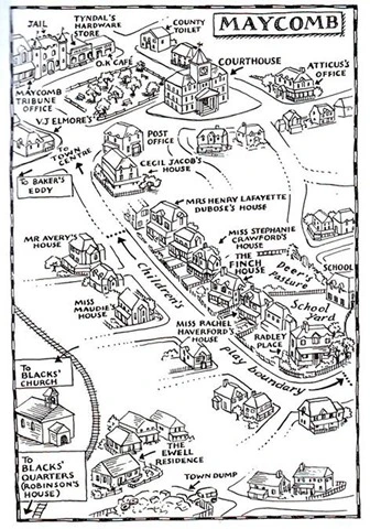
As should be obvious, the following will contain spoilers (although probably not anything you haven’t already heard).  If you haven’t read Go Set A Watchman and intend to, you might want to stop reading at this point (I’m a Map Dork, so as a buffer I’ll throw in a map [found here]).

Maycomb

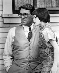
Still here?  Good.  I’ll get right to the point:  Atticus Finch is a racist.  I know this is not easy to accept, but it is, in fact, even evident in To Kill a Mockingbird (although not obvious.  That is reserved for Go Set a Watchman).  Before you get too upset, though, let me explain a couple things.  First off, Atticus Finch is a racist, but only by today’s standards.  By the standards of his own time (To Kill a Mockingbird takes place in the mid-1930s, when Atticus was in his early 50s.  Go Set a Watchman takes place in the mid-1950s) he was something else entirely.  Second, Atticus was what I think of as a ‘benevolent racist’.  Unlike most of his contemporaries he didn’t consider black people to be subhuman (yes – I said black people.  Political correctness is the process of white people sitting around deciding what the new labels should be.  I don’t subscribe), nor did he in any way consider them to be undesirable or even unlikable.  He just didn’t consider them to be equal.  In To Kill a Mockingbird Jean Louise (a.k.a. Scout) states:

“Atticus says cheatin’ a colored man is ten times worse than cheatin’ a white man”

Later, Atticus himself says:

“There’s nothing more sickening to me than a low-grade white man who’ll take advantage of a Negro’s ignorance.”

Atticus’ racism is there, if you have eyes to see it.  Go Set a Watchman just makes it more blatant and obvious.  But it’s not any different.  Atticus is not any different.  His form of racism is a condescending one.  He views black people very much as though they are children.  Children who need our (read: white people’s) help.

Jean Louise, however, is not racist.  She is described (by herself, in the interest of full disclosure) as ‘colorblind’.  Despite growing up in Alabama in the 1930s and 1940s.  How did this happen?  Because she was raised by Atticus FinchTo Kill a Mockingbird and Go Set a Watchman are, in fact, two parts of one story.  Jean Louise Finch’s story.  The story of her relationship with her father.  And how Scout, like every child, eventually comes to terms with her father’s humanity.  How she finally realizes that Atticus Finch has as much right to be flawed as the rest of us.

Jean Louise eventually accepts the fact that her father is human and he therefore has faults.  And she realizes that he is not defined by his faults.  For his part, Atticus learns that he has succeeded in the task that all good parents set for themselves:  he has raised a child who is better than he is (which, by the way, may not have happened if Atticus hadn’t actively defied the dictates of his family and community to allow his daughter to grow up to be exactly the person she desired to be).  At the end of the day, though, Atticus lived in a time and place that was both extremely racist and extremely sexist, and he was years ahead of his time on both these issues.  But not immune to them.  And – truth be told – I’m okay with that.

I am finding, however, that many of the people I know are not.  I am a little surprised and dismayed by how many of my friends are actively avoiding reading Go Set a Watchman (some of them have even concocted elaborate reasons for it).  I wish I could say the reason for this is simply because they don’t want to face the fact that Atticus is a racist.  The truth is that they don’t want to face what Atticus Finch’s racism represents.

We here in the Northeast live in a fuzzy pink bubble wherein we think we have largely beaten racism (we are wrong, and we are also not alone in this).  Because of this, we believe that there are precisely two types of racists in this world:  bad people and stupid people.  We honestly believe that at least one of those two conditions must be in place before racism can even exist, let alone thrive.  So the idea of an inherently decent and intelligent person (like Atticus Finch) who is also a racist is complicated and it makes us uncomfortable and we don’t want to look at it so we instead decide that it can’t exist.

Which only serves to prove that we are failing to understand the nature of racism.

See, racism is not rational.  This is why it does not respond to reason.  Nobody sits down, analyzes all the available evidence, then concludes that the only logical course of action is to be a racist.  Racism arrives through a different vector, and for this reason we cannot combat it effectively with logic and reason.  Also for this reason, otherwise decent and intelligent people can sometimes turn out to be racists.  This invariably occurs during childhood.  If you spend the bulk of your formative years surrounded by a certain way of thinking, there’s a decent chance you will come to believe that said certain way of thinking is normal and/or proper.  Sexism often procreates by this method as well.  As does religion.

Relax.  Before you throw a hissy and accuse me of badmouthing religion, take a moment to look up the word ‘rational’.  And know that most of the religions of the world will back me up on this.  One does not reason one’s way to God.  Religion is not logical nor does it desire to be.  Belief is arrived at through other means.

This is why belief systems (good or bad) need to be kept in check via legislation.  We cannot carefully explain the facts and then expect racists to become colorblind.  We cannot throw logic at sexists and then expect them to suddenly support paycheck equality.  We cannot reason with the religious right and then expect them to see the light in regard to marriage equality.  It simply will not happen and thinking otherwise is just plain dumb.  We need Affirmative Action. We need the Nineteenth Amendment.  We need separation of church and state (make no mistake, folks – the Founding Drunkards were not concerned about freedom of religion.  They were concerned about freedom from religion).  Rationality cannot be applied to belief systems, so the only recourse a rational society has is to protect the general populace from them.

signature.gif

CatamountSo my friend Drew is writing another book.  The last time he did so he asked me to produce some maps for him, a process I detailed previously, and which we plan to repeat (roughly).  This time, Drew’s book is about an individual, who happens to have been born close to where I live.

Being the kind of person he is, Drew has decided to set foot upon all the places most significant in his subject’s life.  Naturally, his birthplace fit’s into this category, so I applied myself to determining where, precisely, said event actually occurred.

Drew already had some pretty good ideas about this, having narrowed the search down not just to a small Massachusetts village but to a particular mountain within said village (coincidentally a mountain I had had occasion to map several years ago, so I already knew my way around rather well).

To narrow our search even further, Drew gave me a copy of a map he had found in a manuscript buried in the local library:

Stacy Map

On the surface, it looked to be a workable map, so I converted it into a format I could work with and set about georeferencing it with QGIS.

The result was less than pleasing.  When it came down to it, I was not working with a map so much as I was trying to georeference a rough sketch.  With a capital “R”.  Under normal circumstances, this is where the process ends, and I simply produce a wildly inaccurate result with a pile of disclaimers attached to it.  But this was for an old friend, which is considerable coin.  Besides – I had some spare time with no pressing projects.

So I turned to one of my favorite mappers, Fredrick W. Beers.  There are Beers maps for everything within a sizeable radius of here and, being an archaeologist and historian, I have had to consult them on numerous occasions.  I can personally vouch for their accuracy whenever they depict objects that are still on (or under) the ground.

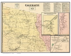
The mountain in question – Catamount Hill – is located in the town of Colrain Massachusetts, so I acquired the Beers map which includes said village and hill, which I then clipped to just the area of interest:

Beers

Unfortunately, the Beers map doesn’t show any of the landmarks that specifically interest Drew, but it does show a half dozen or so that are also on the aforementioned sketch map (the Stacy map), so I figured I could use the Beers map as a stepping stone.

The first order of business was to georeference the clip of the Beers map.  I have found that GIS software is only reasonably good at warping images, so I usually begin this process by helping them along with a little Photoshop chicanery.  As you can see, the Beers map shows a decent amount of local roads, and I have found through experience that most roads in New England haven’t moved much in centuries.  So I opened up QGIS and used a current local road shapefile to make a template image:

Template

I then opened the template image in Photoshop, made the background transparent, and loaded the clipped Beers map underneath it.  Using Photoshop’s image transforming tools, I manipulated the Beers clip until it approximated the template image.  The result I saved for use in georeferencing:

Transform

Note that neither the Beers map nor the Stacy map had any real reason to use any sort of projection whatsoever, so I used Stateplane for the template (and for the rest of the georeferencing process, as well).

I then loaded the tweaked Beers map into QGIS and georeferenced it to the same road file I had used to make the template.  Once that was done, I created a point file of all the landmarks on the Beers map that I planned to use to georeference the Stacy map.  Then I added every other feature on the Beers map because I’m me.

I knew the roads on the Stacy map were out of kilter, so I decided to just ignore them altogether.  I loaded the map as an unprojected and unreferenced raster into QGIS and created a point file of all the features depicted on the map.  I named them all in a column in the table for use in labeling.  I then created a raster image of the labeled feature points, which I then georeferenced to the previously referenced Beers map, using the common features as control points.  I used this final, fairly accurate replica of the Stacy map to create a new point file of all the features in the Catamount Hill vicinity, numbered, typed and labeled in the table accordingly:

Final

Finally – since I wanted to be able to use all of this to locate features on the ground – I reprojected everything and packed it into TileMill, which I used to create tiles for use with an app in my phone (similar to one I wrote about previously, only updated for use with a later OS).

Next week Drew and I plan to go out and put all this to the test.  Part of my plan is to locate a feature that intrigues me just because of its name:  Aunt Dinah’s Stairway.  I’m dying to know what it actually is.  Unfortunately, locating it will entail traveling to a place called Catamount Hill and hiking past landmarks called Bears’ Den and Black Snake Swamp.

Wish me luck.

signature.gif

Post

I’ve been playing video games since – well, since there have been video games.

Sort of.  Technically, the first video game patent was granted in December of 1948 (well before I was born), but I – like most of the world – consider Pong to be the first real video game.  And Pong hit the shelves in 1972.

So I have seen video games come and go, and I’ve played a fair number of them.  I don’t have a favorite (or even a favorite genre), but there have certainly been games I have loved.  The Legend of ZeldaSonic the HedgehogCivilization IIIFinal Fantasy VIIHalf-Life 2.  A few video games have even gone so far as to have had a genuine emotional impact on me (if you know who Aeris or Eli Vance are you know what I’m talking about).  Others have forced me to think to a degree I never expected from a video game (it took me days to fully unravel and digest the final events of BioShock Infinite).  In fact, I would posit that video games are currently on the brink of (if not in the midst of) a process similar to that undergone by cinema about a century ago, more recently by comic books:  transforming from a diversion into a viable (even respectable) medium for storytelling.

Of course, not all video games tell a story, which should not be considered a shortcoming.  Some – by design – leave you to your own devices (to varying degrees).  This is called ‘nonlinear gameplay’, and it comes in a variety of forms.  My personal favorite is what they call ‘sandbox’ games.  Basically, sandbox games give you a world (or a situation) and a set of rules and then leave you to master your own fate.  Kind of like this series of random and happy events we call “life”.  Minecraft is probably the best known sandbox game on the market today.  It is certainly my favorite.

To be honest, though, I probably never would have played Minecraft if it wasn’t for my son.  He started playing, and since I’m one of those annoying parents that actually likes to engage in activities with my child, I joined in.  I’m glad I did.  And I highly recommend it.

Minecraft has a multiplayer mode, which is easy to access and enjoy with a friend or loved one if you happen to have the console version of the game.  If you have the PC version of the game, multiplayer games can be realized over your LAN or by accessing a server.  As you may or may not know, accessing most online servers for gaming is much like entering Mos Eisley.  They tend to be cesspits.  However, on this front Minecraft really comes through for us.  Running your own server is as easy as opening a port in your router and running a simple .exe on a computer.  I have a Minecraft server running on an old computer in my home office, which is further whitelisted so that only my son and his buddies can play on it.  You can also run a Minecraft server on an Amazon EC2 or on Openshift, if you’re so inclined.  When it comes to controlled multiplayer experiences, Minecraft really is the Video Game Promised Land.  And since multiplayer games are collaborative and creative, awesome things can result.

Server

Being a Map Dork, it was only a matter of time before I decided to recreate our town as a playable world for Minecraft.  I had heard rumors about GIS data being translated into Minecraft, so I figured I’d try my hand at it.  What follows is a discussion of the process I eventually went through and a few of the things I learned along the way.  This is not a tutorial of any kind, or even instructions.  The first thing I learned is that the process is intensely enslaved to the particular location chosen.  As usual, the landscape dictates the rules by which we must engage it.

At first, I went at this task in full Map Dork mode.  I had heard of some instances of this being done – entire countries, in fact.  Great Britain has been done, as has Denmark.  I was also aware that Minecraftery was possible using FME, and a minimal amount of searching led me to detailed instructions for doing so.  So I amassed a bunch of data, fired up FME and had at it.

The results were less than satisfactory.  I cannot say whether this was due to a shortcoming on my own part, a drawback of the software, or simply crossed purposes.  I initially suspected the first case, but I am now leaning toward the last.  Looking at the models of Denmark and Great Britain, as well as the FME directions, it would appear that the GIS approach to Minecraft is to use it for building scale models, ostensibly for use for municipal planning and similar nefarious purposes.  I, however, wanted more to build a virtual playground for my son and his friends, modeled on our town.  The idea was to produce something they could virtually walk around in and explore, not just look at and admire.  Which led me to conclude that the GIS approach would not get me where I wanted to go.  Another pitfall of the GIS approach is the assumption that most (if not all) of the cartographic heavy lifting can be done procedurally.  Some jobs are best done by hand (it is worth noting that in the end this project required a rather large commitment of time and energy on my part.  Of course, in my experience dedicating enormous amounts of time and energy to pastimes that only marginally interest you pretty much defines ‘parenthood’).  So I decided to abandon my usual modus operandi and looked instead for a Minecraftian approach.

There are a variety of Minecraft world building/editing programs out there (you can find a good list here).  The one I eventually decided to use is called WorldPainter.  I decided upon WorldPainter mainly for two reasons:  It allows for importing heightmaps and it also allows for using semitransparent overlays on top of said heightmaps.  In total I used three programs (four if you count Minecraft itself) for Minecrafting Greenfield.  Quantum GIS, Photoshop (simply a matter of personal preference.  Any image editor/manipulator would probably suffice), and WorldPainter.  First, I loaded GIS data into Quantum GIS, tweaked it to my purposes and then exported it as various rasters.  Next I used Photoshop to alter and/or combine the various rasters for use in Worldpainter.  Lastly I either imported the rasters directly into WorldPainter, or used them as overlays for guiding further landscape manipulation.  WorldPainter exports Minecraft worlds directly into the folder Minecraft looks to for saved worlds.

Maps are often built in layers, and the order of the layers is both logical and important.  Usually when I make a map I start from the bottom and work my way up.  As an (oversimplified) example, a typical map would start with topography (the bare shape of the land), overlain by hydrography (lakes and streams), then roads and buildings.  Lastly, I might put on some borders (if appropriate) and labels.  In this way features are layered as they are in the real world (we tend to put our roads on bridges over streams) or in the fashion that makes most sense for the map (borders and labels overlying the features they inform or delineate).

Minecraft, however, has its own set of rules.  It has physics (of a sort), but physics that are only vaguely similar to the physics that operate in reality.  For example, water flows downhill, it follows the path of least resistance, and it seeks it own level.  Minecraft only really understands the last of these.  If you tell Minecraft that there is a stream halfway up a mountain, it will want to fill the entire landscape up to that level.  It views your ‘world’ as a flat plain with bumps on it, not as a small portion of a quasi-spherical planet.

An important point to remember is that I was not trying to replicate our town.  We’re dealing with Minecraft here, which can be fairly well described as the LEGO of video games.  My goal was to create a recognizable representation of the town – a Close Facsimile Thereof.  So don’t get upset when I play fast and loose with data.

All the data I used for this project came from MassGIS and OpenStreetMap.  My two go-to sources for geospatial data.  I started with a basic heightmap, generated myself using 1:5000 contours from MassGIS.  I used this heightmap mainly because I already had it, but in fact it was far more detailed than I needed for this project.  A NED DEM at virtually any resolution would probably suffice (but you might as well get the best resolution you can get your hands on because why not?).  To complete my initial basemap I also used a hydrography polygon shapefile (from MassGIS) and a 2D shapefile of building outlines (this one from OpenStreetMap.  MassGIS has a fine one, but OSM tends to have more current data, and there are a couple of new buildings in town I wanted to be sure to include).

I know.  It sounds strange that I’m including buildings at this point.  Bear with me.  WorldPainter works best if we give it as much three-dimensional information as we can from the outset.

A Minecraft landscape has a maximum height of 256 blocks, and a Minecraft block represents roughly one cubic meter.  Luckily, my neck of the woods is hilly but not very high.  The change in altitude in my area of interest is just over 300 meters, which is close enough to Minecraft’s 256 that I can call it even with a straight face (remember – we’re just building an approximation here).  After loading my chosen DEM into QGIS, I went with this ‘scale’ by zooming in to an area roughly 10 kilometers square.  I then created a new Print Composer, set the size to 210 mm x 210 mm and set the resolution to 1200 dpi (this makes for rather large exported images, but when it’s all said and done they scale to roughly 1 pixel = 1 meter).

I decided to deal with the aforementioned hydrography problem by simply cutting water features more deeply into the landscape (I was afraid that this would result in ridiculous chasms in the higher elevations of the project area, but the effect turned out to be less severe than I had expected.  Besides – we are talking about a video game here).  I opened my hydrography polygon layer in QGIS and created a smaller version of it by negatively buffering it.  I then exported images of each hydro layer in turn.  Opening the DEM in Photoshop, I brightened the whole thing slightly so that the hydro layers could dominate the lower end of the spectrum.  I set the image of the original hydro layer to an RGB slightly darker than the lowest end of the DEM, the buffered hydro layer slightly darker than the original hydro layer.  I then merged the three layers into a single landscape.  For a final touch I put a bit of a Gaussian blur over the whole thing, to keep WorldPainter from building cliffs at every elevation change.

Lastly, I put every building in town on the DEM.  I didn’t want them all to just be flat, one-story affairs, so I first separated them out by number of floors.  Luckily, there are no buildings in our town taller than 4 floors, and the only 4-story buildings are on Main Street.  So I used QGIS to separate the buildings into separate layers of 1, 2, and 3 floors.  I further subdivided these into flat-roofed or sloped-roofed layers (Main Street I did entirely by hand, since I wanted it to be more easily recognizable to the kids.  Besides, it’s only one road barely over a kilometer long).  Since the buildings rest upon various elevations (rather than a fixed one), I used QGIS to export a simple black and white image of each layer in turn.  These I placed over the base DEM in Photoshop, using the building images to select the buildings.  I then used that selection to copy the appropriate portion of the original DEM, which I then pasted onto a new, blank layer.  I then adjusted the brightness of the new layer according to the size of the buildings (at the scale I was working at, I found a Brightness of +8 worked for single floor buildings, +15 for two-story buildings, +21 and +28 for 3- and 4-floor buildings, respectively).  I further used Photoshop’s blending options to apply a radial gradient to the sloped buildings, giving them an appearance of peaked rooftops (I use ‘appearance of’ only in the grossest sense.  When you only have blocks to work with, you can only get so close to an actual ‘slope’).

Once I had all of these layers situated, I stacked them all up in Photoshop and merged them into a single basemap (I also resized all the rasters to 9984 x 9984 px in Photoshop.  WorldPainter behaves much better if you give it rasters of a size divisible by 128.  I could have achieved the same thing by adjusting options in the Print Composer of QGIS, but I didn’t realize the need until I had everything in Photoshop).

DEM with buildings

I then imported this combined raster as a heightmap into WorldPainter.  I set the water level to 0 (it defaults to 62, but I wanted a dry map, planning to add the water manually in the following step).  I also removed the noise and beaches, and I deleted all the materials but Grass, which I switched to Bare Grass (overwhelmingly, the area I chose to build is forested, but the forests would come later.  As a secondary choice, I figured universal lawn as a starting point made sense for this project).

WorldPainter

Yes – I now had a town consisting of buildings made out of grass-covered dirt.

Basemap

But that’s okay.  I had plans.  Just after I finished the water, which is up next.

Believe it or not, the basemap was the easy part.  From then on I had to do most of the heavy lifting myself.  But we’ll get to that next time.

signature

Field MapThe overwhelming majority of my professional choices have been heavily impacted by my love of the outdoors.  I am at my happiest in remote locations, far from the presence of other humans.  This has led to fields like forestry and archaeology and even GIS.  But when it comes to GIS, I’m more of a Field Operative than anything else.  By that, I mean I am more likely to find myself out in the field gathering and/or verifying data than I am to be at a computer manipulating data gathered or created by someone else.  Because of this, field maps have always figured prominently in my tool kit.

For a long time, paper maps more than sufficed (still do in a pinch), mainly because they were the only show in town and therefore had to.  Truth is I still don’t go into the field without a paper map and compass, if only because their batteries never wear out and the only GPS fix they require is the one in my head.

More recently, I expanded my tool kit to include some sort of hand-held unit, usually a Garmin.  It wasn’t long before I figured out how to plug my own custom maps into these devices (although I cannot now remember the software I used to do so), neatly laying the information I needed over the pre-existing base maps built in to the devices.

Then smartphones came along.  At first glance you’d think such devices would be tailor-made for my purposes, but it turned out to be otherwise.  Like much of our world, smartphone apps are driven by the market, and a ridiculously high percentage of smartphone users have absolutely no use whatsoever for custom field maps (they do, however, really need to know where the closest cup of coffee is).

So I set out to write my own.  It turned out to be much easier than I had envisioned.

Beside the ability to use my own maps, the next biggest requirement I had was the ability to work offline.  There isn’t much connectivity in the kinds of places where I need field maps, so I needed the ability to store the maps in the device.  Google Maps allows for local caching (for later offline use), but I’m an archaeologist.  I need a field map that looks less like this:

Google Map

And more like this:

FortVancouver-Map

Not surprisingly, Google Play is not overflowing with apps along these lines.  I can’t imagine they’d be big sellers.

Which left me with only one recourse.  What follows is how it went.  This will not be a comprehensive app-writing tutorial.  I simply intend to tell you – in general terms – how I wrote this app, and I will include all the necessary code in case you’re inclined to construct your own.  If you know nothing about app development but want to learn, there are numerous resources available all over the Internet.  Google is your friend.

I use Eclipse when I write apps, which is simply a matter of personal preference.  I mention this only because it means that my description of the process will necessarily be specific to my personal development environment, so if you want to play along you might have to adapt things a bit if your personal preferences differ.

Our target end result is a simple map app with minimal bells and whistles.  I didn’t want to clutter the code too terribly, so wherever I felt a need to explain something, I placed a marker comment saying “Note 1” or similar.  I will address these notes in the body of this post.  Let’s get to it, shall we?

First, you’ll have to create a new Android app.  Call it whatever you want.  I called mine “FieldMap” for obvious reasons.  Before we can start plugging code in, though, we have to import a couple of libraries and add them to our build path.  These libraries are OSMDroid (available here.  I used osmdroid-android-3.0.8.jar) and SLF4J Android (available here.  I used slf4j-android-1.5.8.jar).  Import both of these into your “libs” folder, then right-click on each of them in turn and click on ‘Build Path’ –‘Add to Build Path’.

From here, it’s just a question of plugging the necessary code into the appropriate places.  You should, of course, feel free to alter any or all of it to suit your needs.

Main Activity (MainActivity.java)


package com.fieldmap;

import org.osmdroid.views.MapController;
import org.osmdroid.views.MapView;
import org.osmdroid.views.overlay.MyLocationOverlay;
import org.osmdroid.views.overlay.ScaleBarOverlay;
import android.location.LocationManager;
import android.os.Bundle;
import android.provider.Settings;
import android.view.Menu;
import android.view.MenuInflater;
import android.view.MenuItem;
import android.app.Activity;
import android.app.AlertDialog;
import android.content.DialogInterface;
import android.content.Intent;
public class MainActivity extends Activity {

MyItemizedOverlay myItemizedOverlay = null;
 MyLocationOverlay myLocationOverlay = null;

 private MapController myMapController;

 @Override
 public void onCreate(Bundle savedInstanceState) {
 super.onCreate(savedInstanceState);
 setContentView(R.layout.main);

 LocationManager service = (LocationManager) getSystemService(LOCATION_SERVICE);
 boolean enabled = service.isProviderEnabled(LocationManager.GPS_PROVIDER);

 if (!enabled) {

AlertDialog.Builder builder = new AlertDialog.Builder(this);
 builder.setTitle("GPS Disabled")
 .setMessage("You forgot to turn on the GPS.")
 .setCancelable(false)

//Note 1
 .setIcon(R.drawable.hdpi)
 //

.setPositiveButton("Fix It", new DialogInterface.OnClickListener() {
 public void onClick(DialogInterface dialog, int id) {
 Intent intent = new Intent(Settings.ACTION_LOCATION_SOURCE_SETTINGS);
 startActivity(intent);
 }
 })
 .setNegativeButton("Quit", new DialogInterface.OnClickListener() {
 public void onClick(DialogInterface dialog, int id) {
 MainActivity.this.finish();
 }
 });

builder.create().show();

}
 {
 final MapView mapView = (MapView) findViewById(R.id.mapview);

//Note2

mapView.setBuiltInZoomControls(false);
 mapView.setMultiTouchControls(true);

//

mapView.setUseDataConnection(false);

 myMapController = mapView.getController();
 myMapController.setZoom(15);

 myLocationOverlay = new MyLocationOverlay(this, mapView);
 mapView.getOverlays().add(myLocationOverlay);

myLocationOverlay.runOnFirstFix(new Runnable() {
 public void run() {
 mapView.getController().animateTo(myLocationOverlay.getMyLocation());
 }
 });

 ScaleBarOverlay myScaleBarOverlay = new ScaleBarOverlay(this);
 mapView.getOverlays().add(myScaleBarOverlay);
 }
 }

 @Override
 protected void onResume() {
 // TODO Auto-generated method stub
 super.onResume();
 myLocationOverlay.enableMyLocation();
 myLocationOverlay.enableCompass();
 myLocationOverlay.enableFollowLocation();
 }

 @Override
 protected void onPause() {
 // TODO Auto-generated method stub
 super.onPause();
 myLocationOverlay.disableMyLocation();
 myLocationOverlay.disableCompass();
 myLocationOverlay.disableFollowLocation();
 }

 @Override
 public boolean onCreateOptionsMenu(Menu menu) {
 MenuInflater inflater = getMenuInflater();
 inflater.inflate(R.menu.main, menu);
 return true;

 }

 @Override
 public boolean onOptionsItemSelected(MenuItem item)
 {
 super.onOptionsItemSelected(item);
 switch (item.getItemId())
 {
 case R.id.menu_center:
 myLocationOverlay.runOnFirstFix(new Runnable() {
 public void run() {
 final MapView mapView = (MapView) findViewById(R.id.mapview);
 mapView.getController().animateTo(myLocationOverlay.getMyLocation());
 }
 });

break;

 case R.id.menu_quit:
 Intent intent = new Intent(Settings.ACTION_LOCATION_SOURCE_SETTINGS);
 startActivity(intent);
 this.finish();
 }
 return true;
 }
 }

Note 1:  I include icons in my apps as a matter of form.  It is, however, completely unnecessary.  Whether you include one is up to you.

Note 2:  OSMDroid has built-in zoom controls.  Since pretty much every single device that’s capable of running this app has a touch screen (and it’s safe to assume the person holding the device knows how to use it), I don’t see any reason to clutter up screen real estate with ‘+’ and ‘-’ buttons.  If you would prefer it otherwise, it should be fairly obvious how to bring this about.

The Main Activity calls for an Itemized Overlay to house our compass and scalebar (necessary components of any map).  This particular class doesn’t already exist in the Android SDK, so we’ll have to create it ourselves.  Create the Class inside your package (under ‘src’).

My Itemized Overlay (MyItemizedOverlay.java)


package com.fieldmap;

import java.util.ArrayList;
import org.osmdroid.ResourceProxy;
import org.osmdroid.api.IMapView;
import org.osmdroid.util.GeoPoint;
import org.osmdroid.views.overlay.ItemizedOverlay;
import org.osmdroid.views.overlay.OverlayItem;

import android.graphics.Point;
import android.graphics.drawable.Drawable;

public class MyItemizedOverlay extends ItemizedOverlay<OverlayItem> {

private ArrayList<OverlayItem> overlayItemList = new ArrayList<OverlayItem>();

public MyItemizedOverlay(Drawable pDefaultMarker,
 ResourceProxy pResourceProxy) {
 super(pDefaultMarker, pResourceProxy);
 // TODO Auto-generated constructor stub
}

public void addItem(GeoPoint p, String title, String snippet){
 OverlayItem newItem = new OverlayItem(title, snippet, p);
 overlayItemList.add(newItem);
 populate();
}

@Override
public boolean onSnapToItem(int arg0, int arg1, Point arg2, IMapView arg3) {
 // TODO Auto-generated method stub
 return false;
}

@Override
protected OverlayItem createItem(int arg0) {
 // TODO Auto-generated method stub
 return overlayItemList.get(arg0);
}

@Override
public int size() {
 // TODO Auto-generated method stub
 return overlayItemList.size();
}

}

And that pretty much concludes the heavy lifting.  Now all we have to do is tweak a few things.  The drawable folders can be completely ignored if you’re so inclined.  They will already contain launcher icons provided automatically by Eclipse (unless you chose to replace them with your own), and the folders need no other attention unless you want to include your own graphics (see Note 1 above).  We will need to address the layout, as follows:

Layout (main.xml)

<RelativeLayout xmlns:android="http://schemas.android.com/apk/res/android"
 xmlns:tools="http://schemas.android.com/tools"
 android:layout_width="match_parent"
 android:layout_height="match_parent"
 tools:context=".MainActivity" >

 <org.osmdroid.views.MapView
android:id="@+id/mapview"
android:layout_width="fill_parent"
android:layout_height="fill_parent"
android:clickable="true"/>

</RelativeLayout>

Also, we need to configure a menu:

Menu (main.xml)


<menu xmlns:android="http://schemas.android.com/apk/res/android" >

 <item android:id="@+id/menu_center"
 android:title="@string/menu_center" />
 <item android:id="@+id/menu_quit"
 android:title="@string/menu_quit" />

</menu>

And we also need to give some values to our strings (under ‘values’):

Strings (strings.xml)


<?xml version="1.0" encoding="utf-8"?>
<resources>

<string name="app_name">Field Map</string>
<string name="action_settings">Settings</string>
<string name="menu_center">Center Map</string>
<string name="menu_quit">Quit</string>

</resources>

Lastly, we have to alter the Manifest.  Eclipse will automatically target the latest Android API, but doing so produces a minor clash with OSMDroid.  This issue arises when we overlay the compass and scalebar.  In order to work around the issue, we simply have to tell the app to use an older API.  It’s a simple matter of changing the target SDK to ‘11’.

Manifest (AndroidManifest.xml)

<?xml version="1.0" encoding="utf-8"?>
<manifest xmlns:android="http://schemas.android.com/apk/res/android"
 package="com.fieldmap"
 android:versionCode="1"
 android:versionName="1.0" >

<uses-sdk
 android:minSdkVersion="8"
 android:targetSdkVersion="11" />

 <uses-permission android:name="android.permission.ACCESS_COARSE_LOCATION" />
 <uses-permission android:name="android.permission.ACCESS_FINE_LOCATION" />
 <uses-permission android:name="android.permission.WRITE_EXTERNAL_STORAGE" />

<application
 android:allowBackup="true"
 android:icon="@drawable/ic_launcher"
 android:label="@string/app_name"
 android:theme="@style/AppTheme" >
 <activity
 android:name="com.fieldmap.MainActivity"
 android:label="@string/app_name" >
 <intent-filter>
 <action android:name="android.intent.action.MAIN" />

<category android:name="android.intent.category.LAUNCHER" />
 </intent-filter>
 </activity>
 </application>

</manifest>

At this point you have a functioning map app, although it currently lacks a map.  In fact, if you changed one line of the Main Activity (just after Note 2) from “mapView.setUseDataConnection(false);” to “mapView.setUseDataConnection(true);”, you would have a fine app that pulls map data from OpenStreetMap (you could even pull your map tiles from other sources, like MapQuest).  However, our original intent was to use this app offline, so we now have to give ourselves some local map data, for which we will turn to one of my favorite tools, TileMill.  I won’t go into the mechanics of map production using TileMill – there’s plenty of good resources over at MapBox.

Once you’ve made your map, it’ll be time to get it into the app.  My initial searches on the subject eventually led to this post, which led me to believe such a thing was possible.  It looked as though it may be a little tricky, but I assumed I could beat my head against it long enough to figure out how to make it happen.

This turned out not to be the case.  In truth, it turned out to be rather simple.  In fact, I’d go so far as to call it stupid simple.  It goes like this:

Connect your device as a hard drive to the computer housing the map you exported from TileMill (the .mbtiles file).  On your Android device, navigate to the SD card (/mnt/sdcard).  Create a folder on the SD card called “osmdroid” (without the quotes).  Place the .mbtiles file in the osmdroid folder.

And you’re done.  The app will now see and play nicely with your TileMill-generated map.  See?  I told you it was stupid simple.

But wait – there’s more.  And it gets even better.  Let’s say you need detailed maps of two different and geographically divergent areas in one day.  The logical conclusion is that you’d have to create a large map encompassing both areas.  While this would indeed suffice, the resulting map would likely be far larger than you’d like to stuff into a mobile device.  So it’s a good thing you don’t have to.  If you instead make two separate maps of the different areas, the app will automatically use the one closest to your geographic location when you start the app.  It will not, however, switch between maps as you travel between them (it stays on the one you started with).  This is easily corrected by stopping and restarting the app (besides – just use Google Maps if you need help getting from A to B).

A couple notes on the app itself:  Android does not allow for programmatically starting a device’s GPS (for security reasons).  Because of this, the app checks to see if it’s on at startup.  If the GPS isn’t enabled, the app offers to take you to Location Services to turn it on.  Also, if you exit through the app (Menu-Quit), it automatically takes you back to Location Services to remind you to turn the GPS off (it’s a serious battery hog).  The other button on the menu centers the map on your current location (in case you lose your way while looking around).

Enjoy.

Signature

Blog Stats

  • 26,921 hits

Categories

April 2024
M T W T F S S
1234567
891011121314
15161718192021
22232425262728
2930